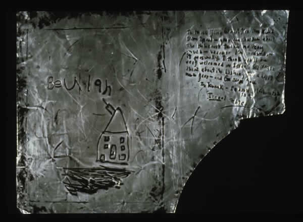
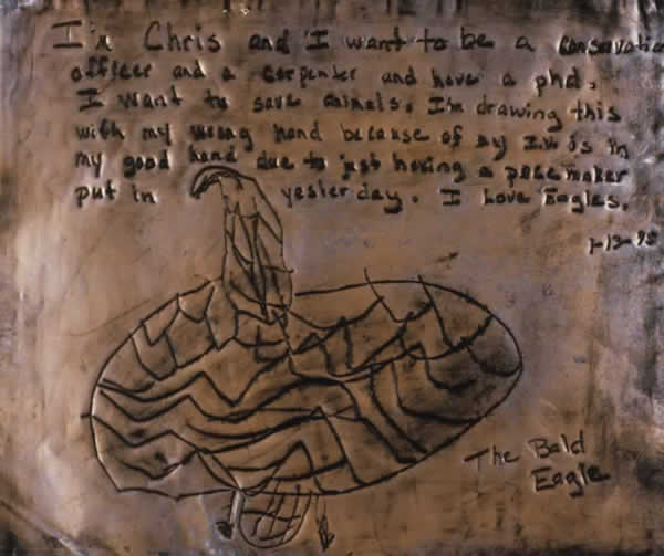
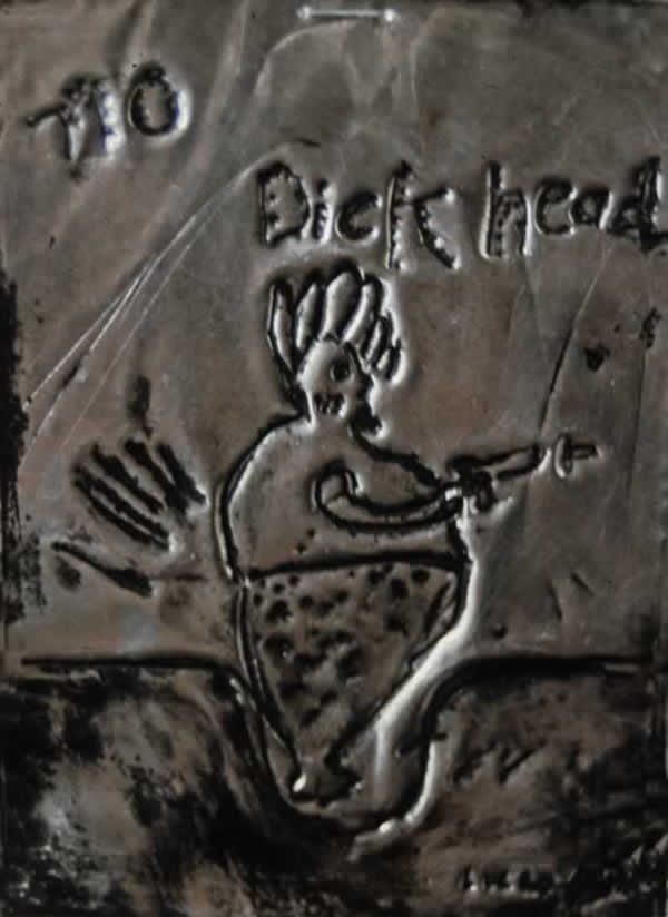

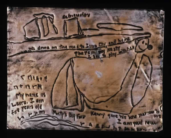

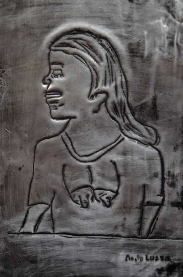
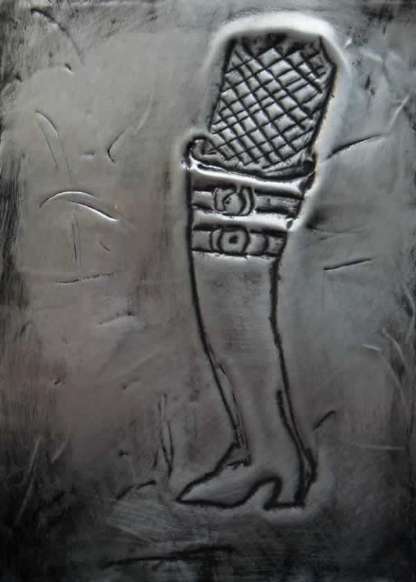
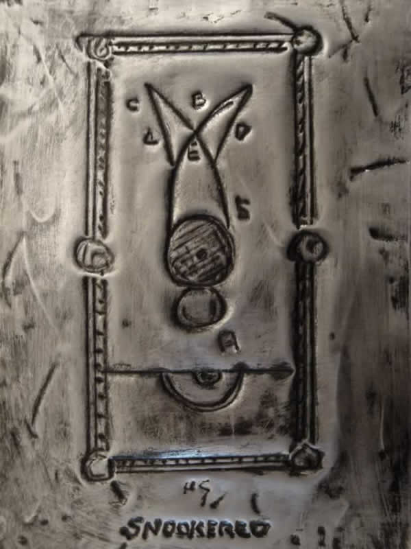
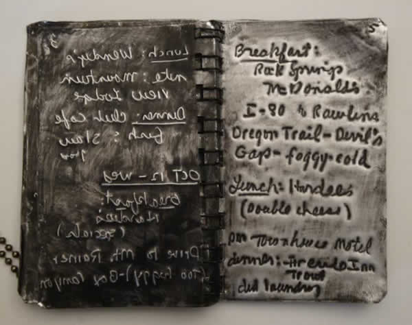
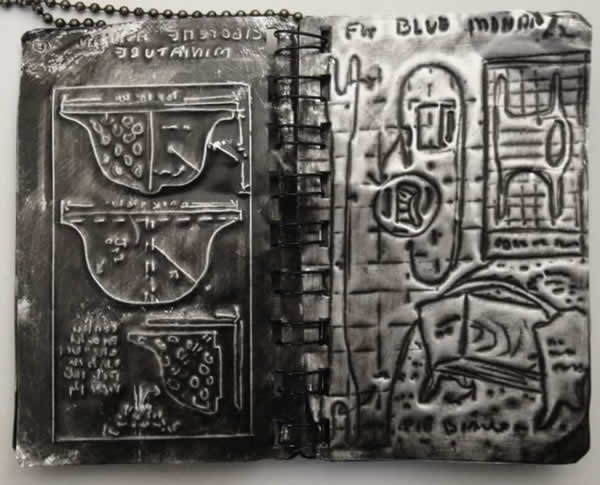
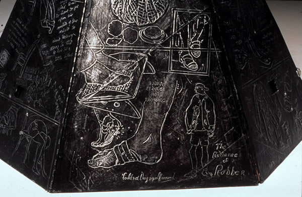
For the past thirty years one aspect of my work has involved the transfer of text and images to 36 gauge aluminum sheets. I first used this material (available at craft stores) after encountering silver Greek Icons while traveling in Crete in 1978. There was something familiar and interesting about the material. It was perfectly suited to the shrines like work I was making at the time (see archives). I noticed that you could buy tin “knock-off” icons on the street in Athens, so I went to a Greek Icon maker to find out how the repoussé quality was achieved. Basically he was working with a very heavy aluminum for copper foil. Suddenly I remembered our copper tooling projects in Girl Scouts! I started drawing on the metal and transferring the text from found notes (by tracing the handwriting on the notes). I found the material interesting for many reasons including it’s cultural references (precious, kitsch). It looks hard and cold but is thin enough to be very malleable and easy to draw into. It reminds some of medieval icons or the Milagros on roadside shrines in Central America and in Mediterranean countries, but it also reminds us of tin foil, the stuff in which we wrap leftovers. Over the years I have developed my own techniques with this material and have used them in workshops during community-based public projects in homeless shelters and hospitals. Often I use the notes in quantity to cover the surfaces of walls and sculptural dwellings.
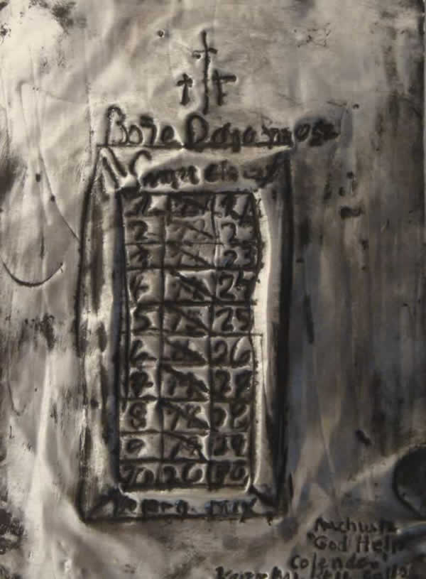

For the past thirty years one aspect of my work has involved the transfer of text and images to 36 gauge aluminum sheets. I first used this material (available at craft stores) after encountering silver Greek Icons while traveling in Crete in 1978. There was something familiar and interesting about the material. It was perfectly suited to the shrines like work I was making at the time (see archives). I noticed that you could buy tin “knock-off” icons on the street in Athens, so I went to a Greek Icon maker to find out how the repousse quality was achieved. Basically he was working with a very heavy aluminum for copper foil.
Suddenly I remembered our copper tooling projects in Girl Scouts! I started drawing on the metal and transferring the text from found notes (by tracing the handwriting on the notes). I found the material interesting for many reasons including it’s cultural references (precious, kitsch). It looks hard and cold but is thin enough to be very malleable and easy to draw into. It reminds some of medieval icons or the Milagros on roadside shrines in Central America and in Mediterranean countries, but it also reminds us of tin foil, the stuff in which we wrap leftovers.
Over the years I have developed my own techniques with this material and have used them in workshops during community-based public projects in homeless shelters and hospitals. Often I use the notes in quantity to cover the surfaces of walls and sculptural dwellings.
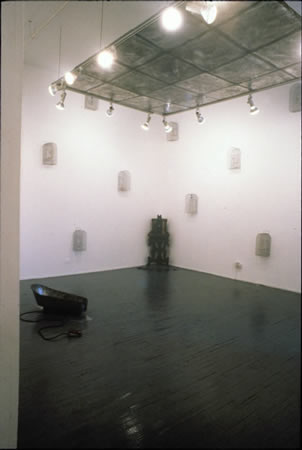


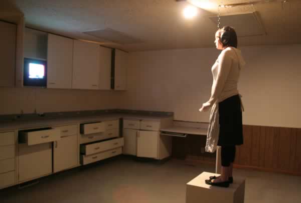
Slow Dip Steady Drip is a series of installations exploring experiences of illness, dislocation, and eroticism. It is a shrine to the extraordinary nature of life in bed, embodying its most peculiar, ridiculous, and meaningful (less) qualities.
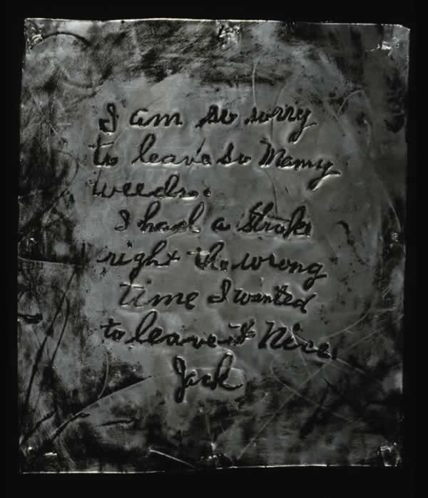
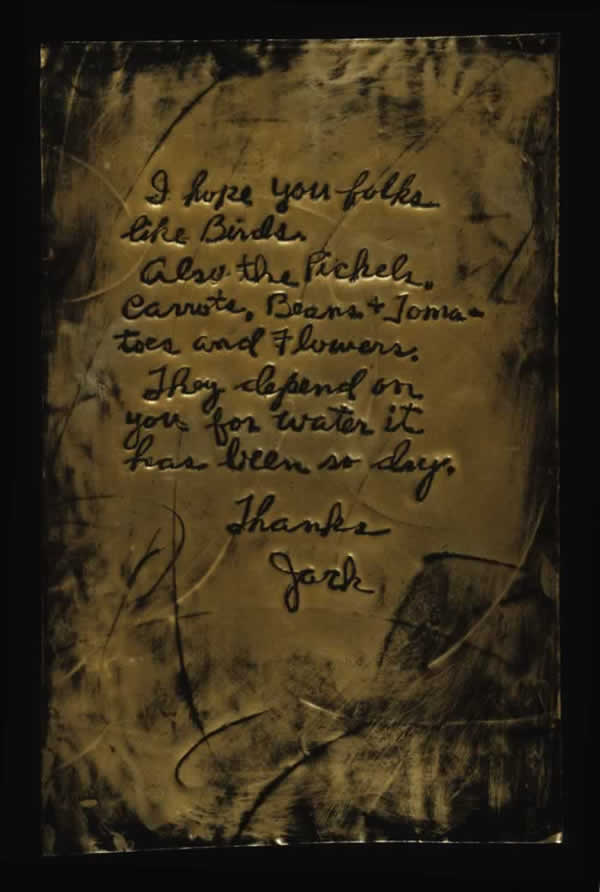
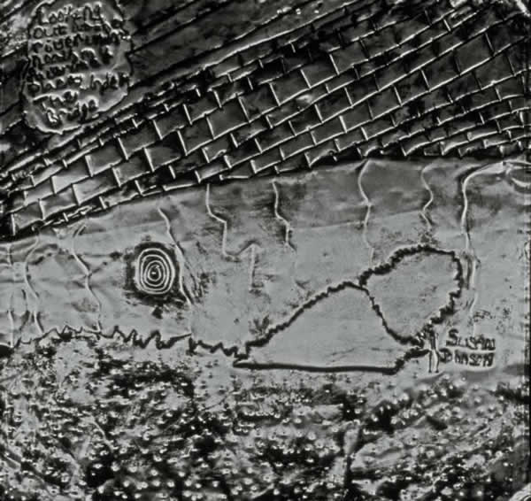
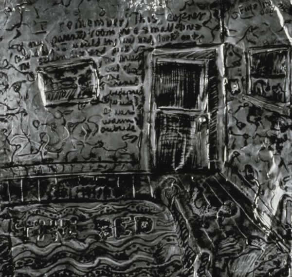
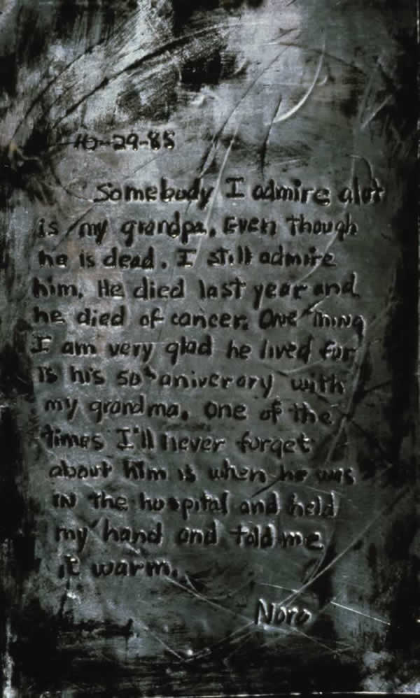
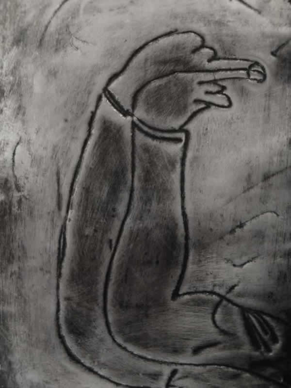
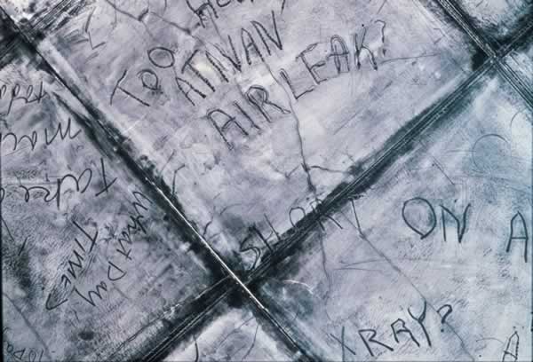
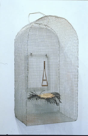
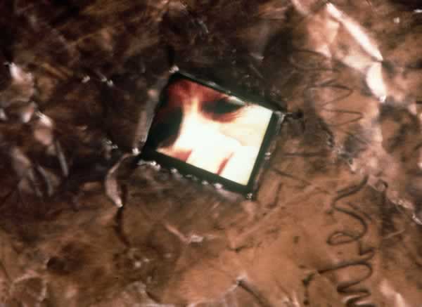
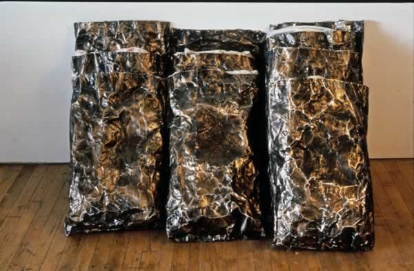
Small wire cages are scattered across the walls of a large room where text-covered metal pillowcases hide old feather pillows from a recently closed convent and reveal tiny video images of open mouths, songbirds, and healing touches. Inside each crudely made cage is a solitary object floats above a tiny pillow. Small pools of liquid testify to a leak from some unidentified source. Looming above is an etched metal lowered ceiling covered with my mother’s scribbled requests while on a respirator and unable to speak.
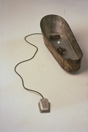
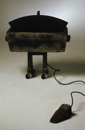
My father’s childhood metal baby bathtub holds a trapped video image and emits seemingly unrelated sounds. In one corner a desk is covered with laboriously hand-made metal books documenting stories of water, illness, and love. Another tiny monitor shows images of dancing couples, rushing water, and nervous hands. In the background we hear a soundtrack – our dance instructor directing us in the Foxtrot, while flies buzz, drips drip, and scissors clip.
During the past twenty years one component of my work has been a series of community-based public projects working in homeless shelters, hospitals and long-term care facilities. The new millennium these experiences connected with my own life in unexpected ways. My sister was diagnosed with cancer and my mother spent a month in Intensive care with a rare pneumonia contracted in a hospital waiting room.
In my community-based projects we concerned ourselves with those spaces where place, object, and identity intersect. In workshops and journaling, the bed in both its domestic and institutional setting became a source for memories or sounds, words and images. Endless hours in bed create a strange combination of fantasy and reality – dripping faucets, dripping IV’s, dipping numbers of vital sign monitors – images of better times in better beds under better circumstances. Bed became a prison for some, a space longed for by others. In this sense, then, each wire cage in the installation serves as a portrait of a psychological and an actual space. Slow Dip Steady Drip explores the ways we give meaning to the most incidental encounters in times of solitude or stress.
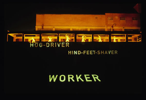


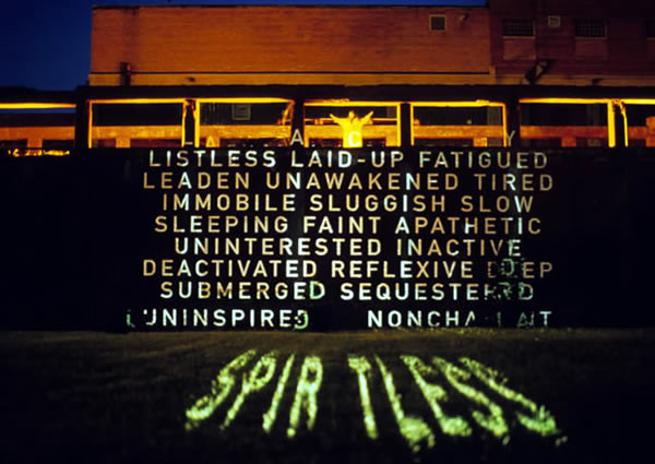
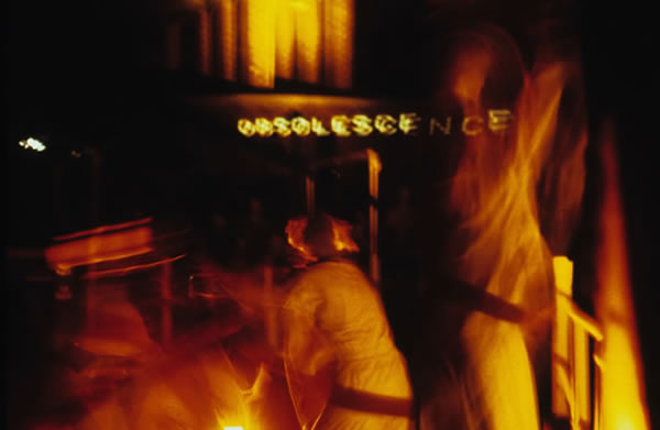
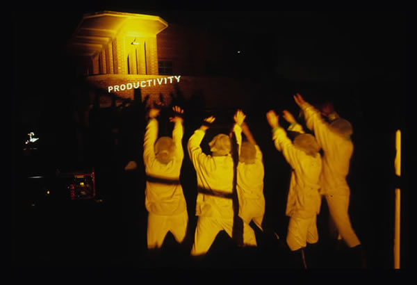
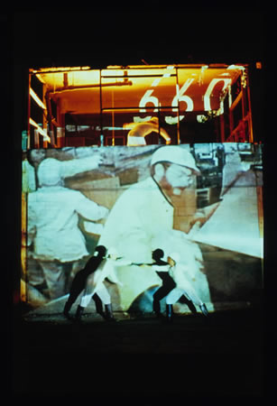
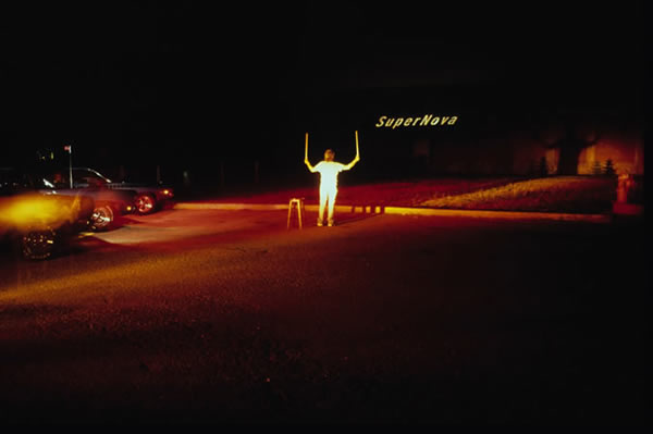
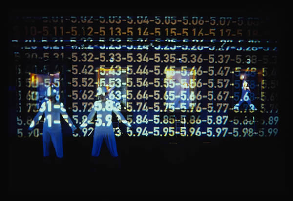
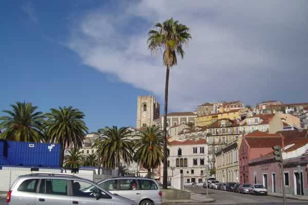
Public artists Jane Gilmor and BJ Krivanek joined together with Community Architexts to present Work-Shift, a large-scale sequential site activation at the former Sinclair-Wilson-Farmstead meatpacking plant–in operation from 1871 to 1990–in the devastated industrial neighborhood of Oak Hill in Cedar Rapids. Sited at an abandoned meat packing plant in Cedar Rapids, Iowa (once the second largest facility of its type in the world), WORK-SHIFT was a yearlong research project culminating in a July 2001 mobile multimedia performance. As the industrial era becomes the digital age notions of work and gender are altering. This performance gives homage to women factory workers from twentieth century.
The audience for the hour long event (held nightly during the Cedar Rapids annual Freedom Festival) was transported in a stock trailer from scene-to-scene along the perimeter of the old Farmstead factory, viewing text/video/ slide and computer projections along with live dance movement and narration to activate and articulate the lost histories of the site. Described by reviews as “drive-by History that mines the social landscape of Middle America in the late twentieth century,” this site-activation was based on months of reviewing state historical society records and interviewing women who had worked at the plant. Local women high school students created a web site based on their reactions to these interviews and their notion of what “work” would mean in their lifetime.
The project was collaboration between Chicago’s Community Archtexts, B.J. Krivanek, Jane Gilmor, Mathew Butler, Kelli Spengler, Nathan Peck, Kelly Mclaughlin and Metro High School among others. Funding was provided by grants from The National Endowment for the Arts, The Iowa Art Council, Legion Arts, and Mount Mercy College.
Work-shift was a community-based project that culminated in a site activation at an abandoned factory in Cedar Rapids, Iowa in July 2001. Work-shift collected and articulated publicly the narratives of the largely invisible community of displaced women workers once employed at one of the world’s largest meat packing plants. The final experiential activation of the site incorporated performance, projections (video, slide and text) audio and a website to highlight past and present labor histories.
The testimonies of displaced women workers were mechanically projected and juxtaposed with computer generated work by young women students onto urban abandon factory buildings. Work-shift explored the vulnerabilities of labor in the post-industrial Midwest and was intended to facilitate cross–generational discovery between two groups –women and girls, who have and will face very different working lives.
Sound: The sound scape was a digital collage created by multimedia artists Matt Butler, with transcripts from interviews read by Victoria Grube, which was constructed of layers of archival machine sounds and workers’ voices, submerging and emerging from the noise.
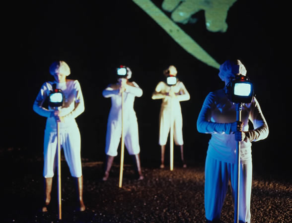
Movement: The performers developed a palette of choreographed movements that were either synchronized (based upon actual workers’ repetitive task motions) or improvisational. Artist Debra Jacque choreographed the movement and worked with Kelli Spengler and women students from nearby Metro High School.
Machines: Machines were omnipresent in this performance -as desired objects, as sounds, as systems –both repressive and expressive.
Video + Media: The videos projects on the site were either archival film footage of workers (like -x-rays into the past of the buildings) or re-creations of actions remembered by former workers. Chicago artist Nathan Peck created the videos.
Language: words are used in three ways: 1) A voice over narrative composed of many women’s stories 2) Projected inscriptions with taxonomies of job titles: 3) Archival voices were subsumed into the digital soundscape as if ghosts of the machines.
Work-shift was an act of urban infiltration intended to appropriate, reconfigure and inscribe buildings and structures. Work-shift was collaboration between Jane Gilmor and BJ Krivanek of Community Architexts, a non-profit Chicago-based art organization with the mission of reclaiming the practice of public inscription on behalf of invisible communities. This project was funded by Creativity in Design Grant from The National Endowment for The Arts, an Iowa Arts Council Project Grant, and a grant from the Greater Cedar Rapids Foundation.


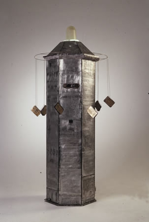

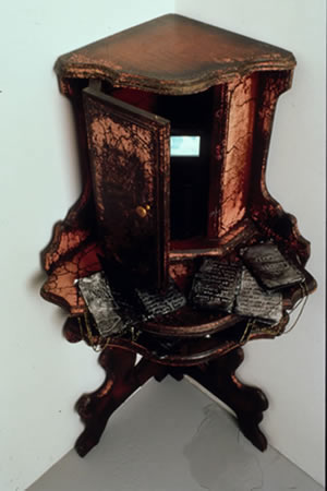
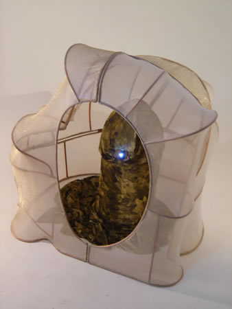
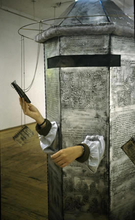
The Architecture of Migration, Rearranging the House (2000) is the first in a series of wearable structures that both connect and disconnect their inhabitant with the exterior world. The initial piece was created while doing a residency at the Banff International Centre and came out of a rather pretentious discussion of the Lacanian struggle between presence and absence. The work explores identity, dislocation and border crossings: public/private, rural/urban, poverty/privilege, male/female.
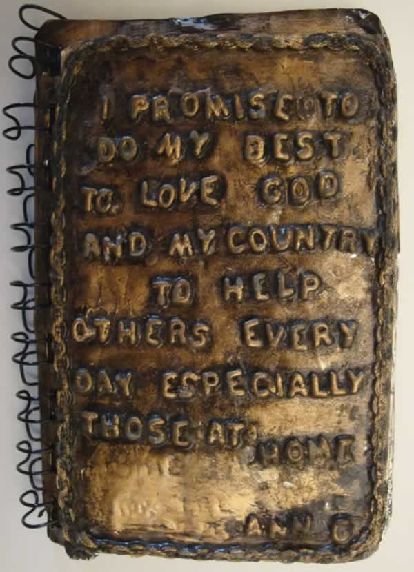
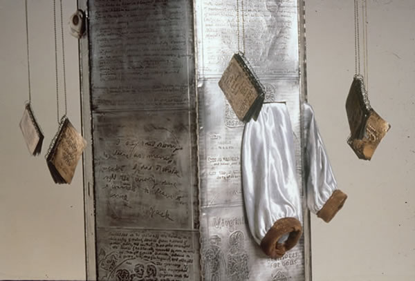
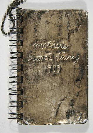
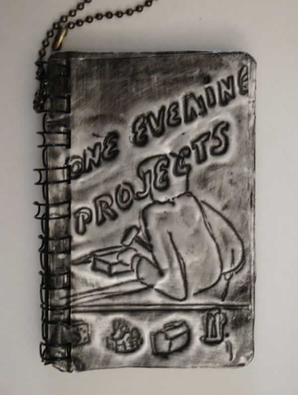
The exterior metal skin is covered with text from U.S. government travel alerts, Canadian nationalist websites, my mother’s travel diaries, notes from homeless teens, and directions from the Encyclopedia of Crafts. The viewer can enter the structure and become a performer by extending arms through the provided sleeves and peering out a screened opening to read any one of seven metal books hanging from a rotating elevated hoop. This process is an intentionally awkward one. Overall the form resembles that of an enormous baby bottle.
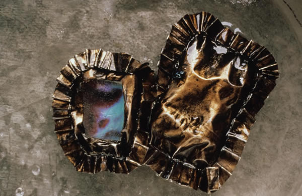
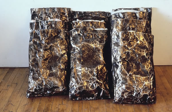
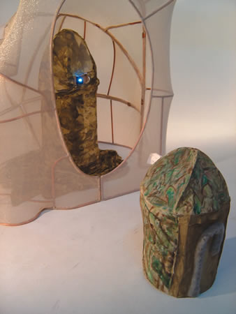
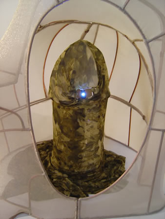
The interior of Migration is a warm copper incised with text and marks made by a hospitalized woman while on a respirator (near death). There are two 2″ video monitors embedded in the exterior walls. The vides show an erotically charged close-up of thumb rubbing circles into flesh, a hand covering a mouth, and a couple learning the Foxtrot. Related to The Architecture of Migration is Pillows, a series of twenty hand-fabricated aluminum pillowcases (with feather pillows from a convent inside) resting against the gallery wall in rows. One pillow has a tiny 2-inch monitor with video.
This work took on new meaning for me when it opened at a gallery in New York on September 10, 2001. The following day I watched the events of September 11th unfold from my window several blocks north of the World Trade Center.
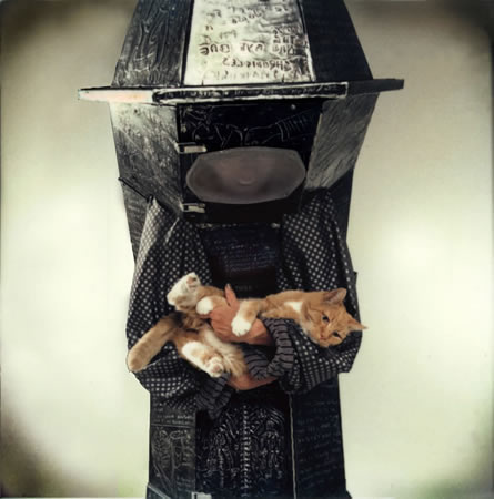
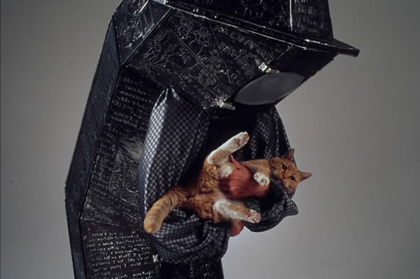
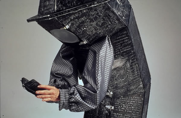
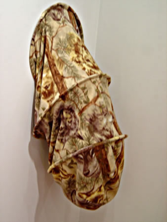
The Architecture of Fatigue (2003-4) is the second in my wearable structures series sometimes referred to as Containers for the Self. The seven-foot wood structure is covered with text incised on 36-gauge aluminum. One enters the structure under very awkward contorted conditions. The wearer must take the drooping posture of this bent over form, extending arms into its dangling sleeves.
Superficially based on psychological research showing that physical posture as well as facial gesture can affect mood, the piece responds to the personal and cultural sense of “overload” that has come with our post-industrial era. Again the wearer can connect with the external world only through touch and obscured vision. Covered with text and images from early twentieth through twenty-first century ads, one sees remedies and contraptions designed for energy restoration. In a pocket under one sleeve are several small metal artists books including Ann Sakaguchi’s The Eye Bag Chronicles as well as excerpts from Rest Room Worlds. Three two inch video monitors in the “skirt” of the structure reveal loud, almost erotic, moaning and show the artist’s hand rubbing her face and eyes in close-up. Ironically the structure appears in a passive, submissive posture of exhaustion, yet when an arm suddenly moves to touch someone, viewers jump back in horror.


AIR Gallery, New York, 2005
An installation by Jane Gilmor in collaboration with David Van Allen (The Architecture of Fatigue), Rick Edelman (Big Mother Blind), Mathew Butler (Blind and Zip video projections)
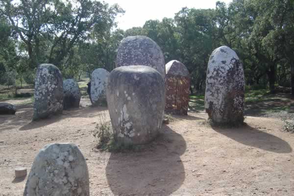
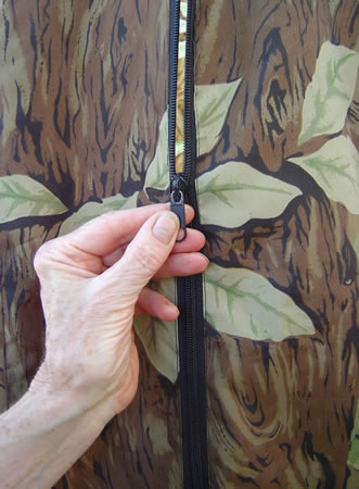
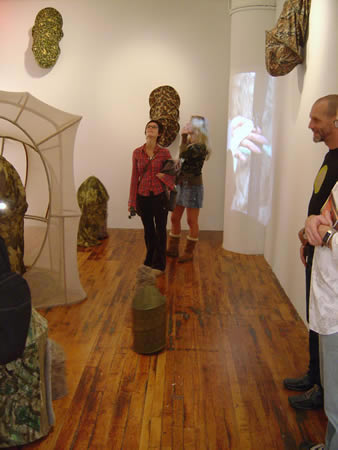
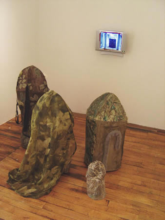
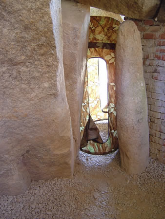
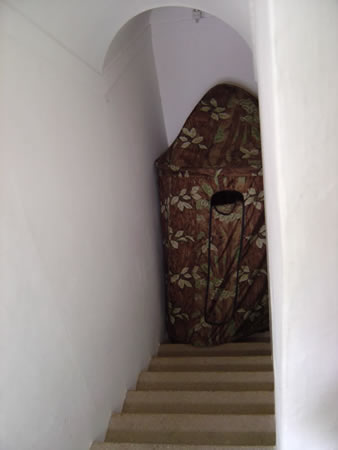
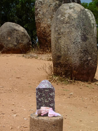
Gilmor has created a room-sized installation of fabric and fabricated metal sculptures who trace their ancestry to a peculiarly designed hunting blind. A five minute film of the original blind (with the artist inside) insinuating itself into highly charged sites in Portugal-Druidic stone circles, 5000 year-old dolmens and 15th century convents – is playing on a small flat screen monitor on one wall. Circulating helpfully around the room dispensing Kleenex, vacuuming up and even responding to remote control demands from visitors are three smaller motorized versions of the hunting blind. Shining through a slit in the large blind and projected on a nearby comer is a video loop of Gilmor’s hand endlessly unzipping a zipper.
As she has over the past thirty years of work, Gilmor has plinked a number of nerves, some raw, some ticklish, and has gently woven our conflicted strands of amusement and discomfort into something strangely moving and profound. The literal meanings of the object begin to give way under the weight of the overburden of information Gilmor has built into the installation. We might notice, for example, that the original hunting blind has a distinctly phallic form, and the smaller mobile blinds somehow add poignancy to the absurdity of their determined putt putting about. The visual and verbal punning of the blind phalluses is characteristic of Gilmor’s work, as is her restraint, if that is the right word, in exploiting the issue. Her observation that it is amusing when hunters disguise themselves as fabric phalluses to blast away at wildlife is offered to the viewer without an intervening and enervating polemic. The joke is implicit, latent and all the funnier for that.
Her restraint holds, even in regard to another surreal aspect of the blind’s history: the duck blind is designed to be handicap accessible. This information, and the grotesque hilarity of building a contraption that allows the physically challenged to indulge in the maiming and crippling of the odd passing duck is once again acknowledged, but not commented upon. A political critique may be read into the military adventurism and the asymmetrical projection of power implied by these mobile bunkers. Gilmor refuses as always to be trapped by specificity, though, and the satire is entirely latent in its obviousness; present, but not accounted for. It is the viewers’ privilege and responsibility to draw their own conclusions.
Gilmor in fact, has no interest in condemning the hunters at all or in encouraging us to laugh at them. She is far too sophisticated and generous a spirit for such smallness of vision and such strategic predictability. It must be said in fact that the whole scene is rather jaunty, and we cannot help but be swept up in the slapstick spirit of the thing, checked by the note of dread and caution supplied by the videotape of the hand in its endless Sisyphussian pursuit of a completed zip. That systemic failure of the hand to complete its journey condemns the entire endeavor to an endless limbo. Everything, and everyone (including, crucially, the artist herself) is caught in a permanent vicious cycle, a perverse closed loop of good will, bloodlust, vanity and pure brilliant stupidity that seems close to the core of Gilmor’s take on the human condition”.
(Excerpt from the Blind catalogue essay by Matt Freedman, 2005)
For the complete essay click here.
Matt Freedman is an artist and writer living in New York.
Thank you to the following individuals and organizations for their support and contributions to this project.
Matt Freedman, Crit Streed, Kathryn Hagy, Agneizska Ligendza, Linda Scarth, and Margery, Fred and Ann Gilmor, Barry Sigel, Dan Ellis, True Identity Design, Haleh Niazmand, and John Foster, Avatar Design,
Mount Mercy College Faculty Development Fund
Fulbright Senior Research Scholar Program
A.I.R. Gallery, New York
iRobot, manufacturer of Roomba vacuums
Coe College Art Department
True Identity Design
The printing the BLIND catalogue was supported in part by a 2005 Artist’s Mini Grant from The Iowa Arts Council. A division of the Iowa Department of Cultural Affairs
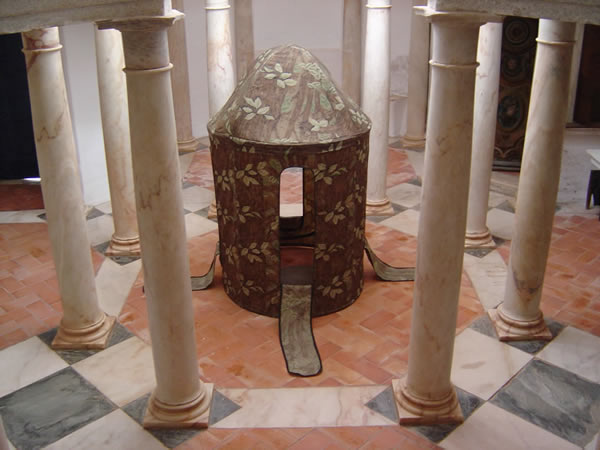

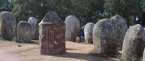

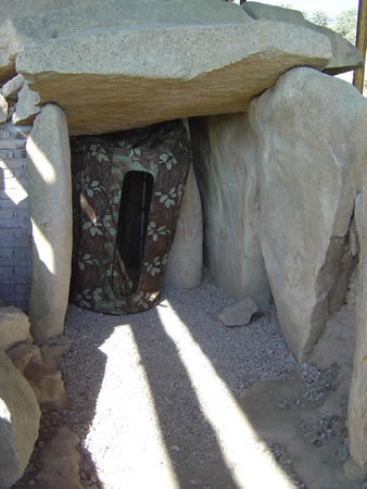
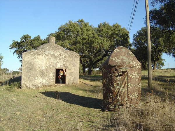


Eight years ago while shopping in a local camping store a friend and I spotted a peculiarly shaped camouflage print tent on display. I was attracted by it’s form, which reminded me of some of my earlier wearable sculptures. The tent was advertised as a “wheelchair accessible hunting blind”. It was on sale.
I starred at this “blind” in my studio for three years before it began to infiltrate my work becoming a habitat for the artist on several occasions. Because it was so portable (fit into its own backpack) and related to the current international situation (The Iraq War), I took it with me for my 2003 Fulbright Fellowship in Portugal, where it insinuated itself into some very unexpected environments. Extending from the Portugal project, I’ve used the blind and constructed mini-blind reincarnations of it to explore issues of voyeurism and paranoia in an era of surveillance and domestic, as well as international, terrorism.
Jane Gilmor, 2006
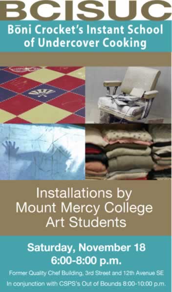
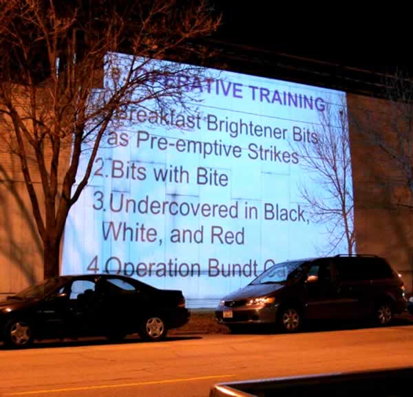
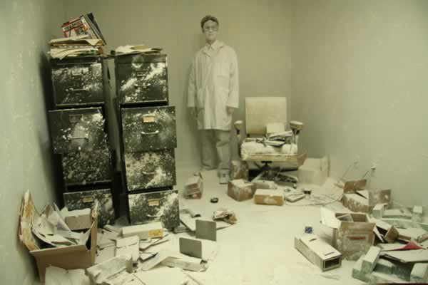
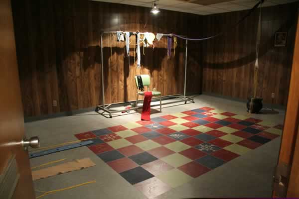


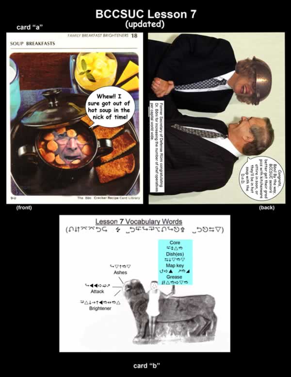


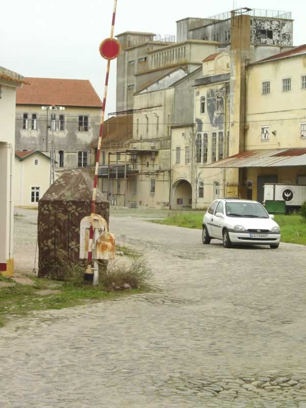
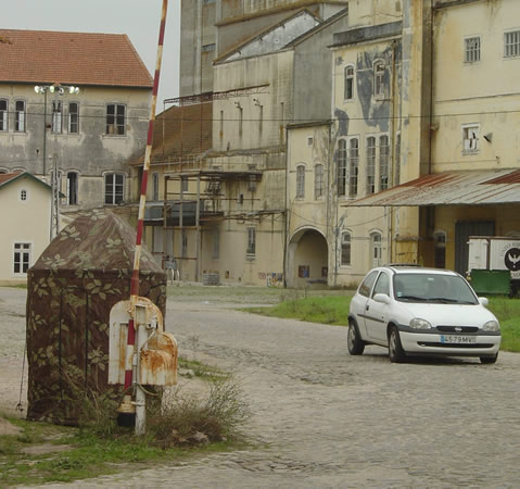
Abandoned Quality Chef Building, Cedar Rapids, Iowa: Boni Cracker’s School of Under Cover Cooking Installation
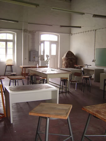
As part of my New Genres class at Mount Mercy College each year we find an abandon factory, house or storefront site for the students to create site-specific installations. In 2006 and 2007 the city allowed us to use the former Quality Chef Frozen Soup factory and laboratory building in Cedar Rapids, Iowa. I collaborate with the students on this project, which culminates in a public opening with performances, video and other site-specific installations.
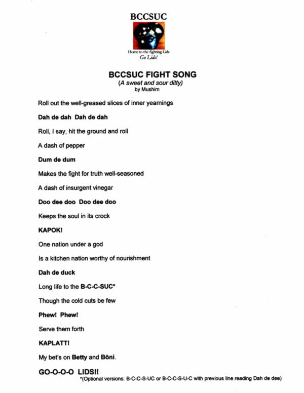
In 2007 I invited my long time colleague, friend and collaborator, Ann Gerber Sakaguchi in the San Francisco area (aka Bette Booda, Boni Cracker, etc) to get students involved in her latest project as part of the Quality Chef project. Ann had taken the altar ego of Boni Crocker and had started the Boni Cracker’s Instant School of Under Cover Cooking in response to the political climate in the years preceding Obama’s election. BCSUC, as it is known, has also served student in Chicago and in Ohio, where I assisted Boni by running her 2-hour degree program, administering lessons and diplomas.
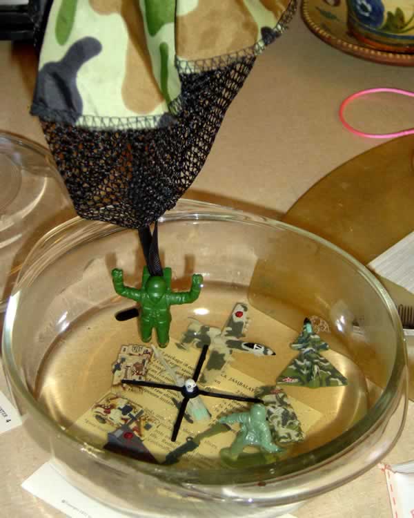
On this page you first see Boni Cracker’s package, the school’s manifesto, admissions posters, admissions process, and a selection of the mail order lessons my students completed. The last Row of images shows several of the student installations in the laboratory and research division of the abandon soup factory in Cedar Rapids.


The Architecture of Migration, A Semester at Sea, and Morton’s Salt: Burnout all reference the psychology of personal and cultural migration a well as issues of mobility and consumerism in our post-industrial era.
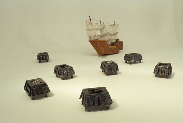
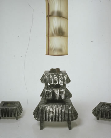
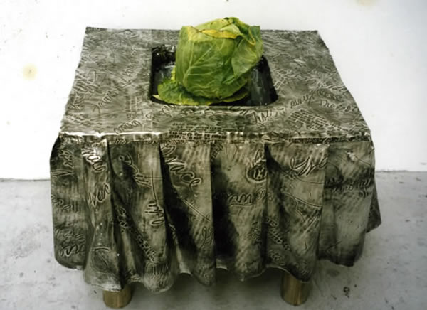
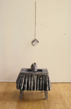
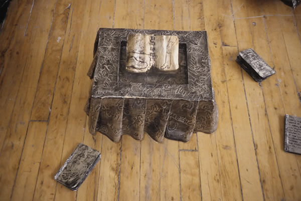
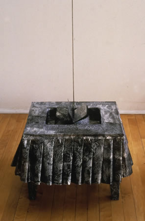
The installation, A Semester at Sea, created for Maharishi International University in 2004, presents a five-foot long replica of a sailing ship painstakingly hand fabricated completely from burnt wood matchsticks. The ship was created by a school janitor and later given to me. On the floor surrounding the ship (from which a small pool of water oozes), are smaller artist made tables covered with hand sew ruffled metal tablecloths, each housing a small indented central pool of liquid from which a tiny metal book or a large cabbage emerges. The space is dimly light so the glossy grey tiled floor appears to be water. In one corner The Architecture of Migration towers above the scene reading from it’s various rotating texts.
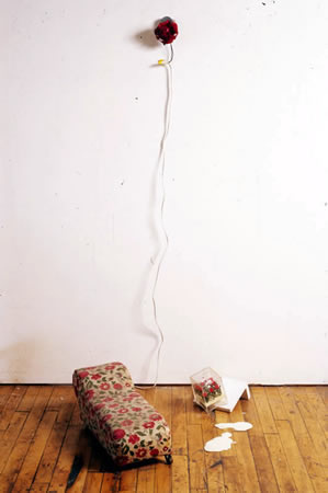
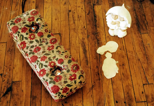
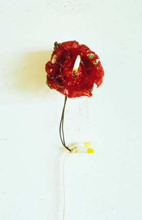
Morton’s Salt: Burnout is a smaller installation from 2004. The piece centers around a small handmade Mexican wax candle (in the shape of a rose and referencing my mother) burns while rotating on a motorized disc on the wall. On the floor below, from my father’s childhood toys, is a miniature doll-sized fainting (psychiatrist’s) couch on wheel. Two tiny video monitors show close-ups of the same burning melting candle on the wall and a detail of two hands clapping. The video monitors appear to activate the floral rose-patterned fabric covering the couch. Nearby ceramic bisque-fired Morton’s Salt Girls (joined at the hip and meant to refer to my sister and I) stare at a large pool of white liquid.